Dating Vernor's Logos
All Vernor’s collectors share a frustration when it comes to trying to date Vernor’s advertising and memorabilia. While some things have the date printed right on them, others are a mystery.
The problem in dating some items is that the logo stayed basically the same for so many years. Let's take a look at how the logo has changed over the years and share an educated guess at the time periods for each logo.
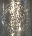
The bottle to the left is from 1906. You’ll notice the VGA logo, for Vernor’s Ginger Ale, at the center. It is believed that 1896 was the first time Vernor’s was bottled. Previously, the extract had been bottled, but not the pop itself. Bottling technology improved enough by 1896 to allow a highly carbonated beverage to be bottled, delivered and kept at home. The VGA logo was embossed on the front of the early pop bottles, but also was found on the bottom of bottles for years. It was still on company stationery in 1928. Many of the bottles with VGA on the bottom also had a paper label on them with a different logo.
All Vernor’s collectors share a frustration when it comes to trying to date Vernor’s advertising and memorabilia. While some things have the date printed right on them, others are a mystery.
The problem in dating some items is that the logo stayed basically the same for so many years. Let's take a look at how the logo has changed over the years and share an educated guess at the time periods for each logo.
The bottle to the left is from 1906. You’ll notice the VGA logo, for Vernor’s Ginger Ale, at the center. It is believed that 1896 was the first time Vernor’s was bottled. Previously, the extract had been bottled, but not the pop itself. Bottling technology improved enough by 1896 to allow a highly carbonated beverage to be bottled, delivered and kept at home. The VGA logo was embossed on the front of the early pop bottles, but also was found on the bottom of bottles for years. It was still on company stationery in 1928. Many of the bottles with VGA on the bottom also had a paper label on them with a different logo.
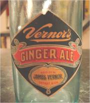
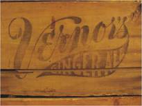
The earliest paper label pop bottle is shown on the right. (There are earlier extract paper labels.) The script Vernor’s logo has many of the same qualities here as it did through 1968. The question for collectors is, when did the script logo begin?
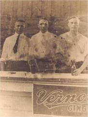
This early picture on the left is a print made from a tintype. This type of photography was most common during the mid to late 1800s, but was still being used in 1920. So, the photo doesn’t help us pinpoint the date of the logo. The 1906 embossed bottle may have had a paper label on the non-embossed side. The logo on the first paper label bottle and the tintype both match. So, we're probably looking at the 1910 era when the script lettering began. Before 1896, we assume there was no “official” logo. At least, the famous script Vernor’s logo was not in use. The Vernor’s name appeared in a variety of capital block letters, probably depending on who did the printing. Early photos of the Vernor Pharmacy show the name in block letters on the awning and in block letters painted on the side of the building.
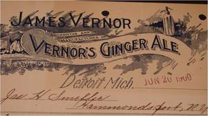
The invoice to the right is from 1900. While it’s obvious there was no script logo, it’s often difficult to determine exact dates because Mr. Vernor may have wanted to use up invoices. I have found that to be true in later dates.
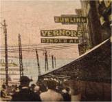
The sign to the left is from a postcard dated 1907. This was at the 33 Woodward Avenue location, which was James Vernor's second location.
This early case to the right has the script logo on an angle. It could be one of the first attempts to angle the logo by inserting “ginger ale” in the underlining. My guess is these cases spanned a number of years, probably from 1910 to 1920. And, due to their durability, many lasted beyond those years.
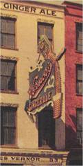
By 1914, we know the building sign above was replaced by the script logo sign to the left. This same sign also placed the Vernor’s logo on an angle much like the case above. This "angled" logo would last through today's modern Vernor's logos, although the script lettering would not.
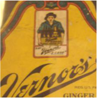
A delivery boy, not the gnome, was the first company graphic. He probably appeared in advertising in about 1910. His appearance on bottles is guessed to be about 1915.
We know the gnome appeared in advertising as early as 1924. Both the gnome and delivery boy appear on the same advertising items as late as 1933.
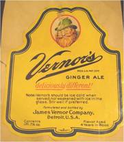
This same lettering would stay on all Vernor’s items until 1959. Vernors became publicly owned, not family owned, when stock was first sold in 1959 and the apostrophe was dropped. The script logo, without an apostrophe, remained until 1968.
Logos since 1959
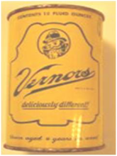
In 1959, the logo remained basically the same as it had since 1910 except there was no apostrophe between the “r” and the “s” of Vernors. There are several interesting collectibles from that era that have both logos on the same item. This must have been fairly common during logo transitions, as Vernors has several examples. On the ACL bottles, the oval was added to the neck in 1959. There was also a green version of the yellow can to the left.
Logos since 1959
In 1959, the logo remained basically the same as it had since 1910 except there was no apostrophe between the “r” and the “s” of Vernors. There are several interesting collectibles from that era that have both logos on the same item. This must have been fairly common during logo transitions, as Vernors has several examples. On the ACL bottles, the oval was added to the neck in 1959. There was also a green version of the yellow can to the left.
The company moved away from the script logo in 1968. The new logo had the letter “n” dropping below the other letters. The gnome took quite a design change, too.
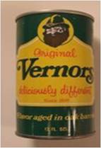
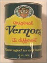
In about 1976, another new logo was introduced. The low “n” was removed and the “s” was made bigger. This lettering change has survived through today. The gnome went back to more of his old look even before this lettering change.
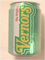
In 1985, there was a radical design change. The lettering stayed about the same, but the rest of the design was completely changed. The lettering went vertical (on cans, not bottles). The gnome was also dropped.
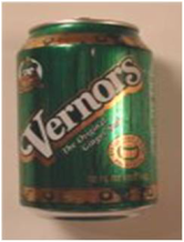
In 1991, another major design change was made. The logo went back on an angle and the multi-colored bubbles were inserted beneath the lettering. In 1996, the can added more colors and more bubbles.
he 2005-2006 can design dropped the bubbles beneath the lettering and added the barrel bands. The can on the right shows the design for 2006-2007, which includes the gnome to the upper left and a barrel to the lower right. The angle of the lettering also changed slightly.
In 2015, the design is very similar to that in 2006. The gnome is still there. The barrel is still there, but no longer says "aged for three years". The barrel bands are still there.
